
The hazing posters in the MASC had little to no images, so they worked as examples of good use of Display Type. In particular the “Rule of Nineteen” one (seen below) was a fun read, so I decided to use that as my example.
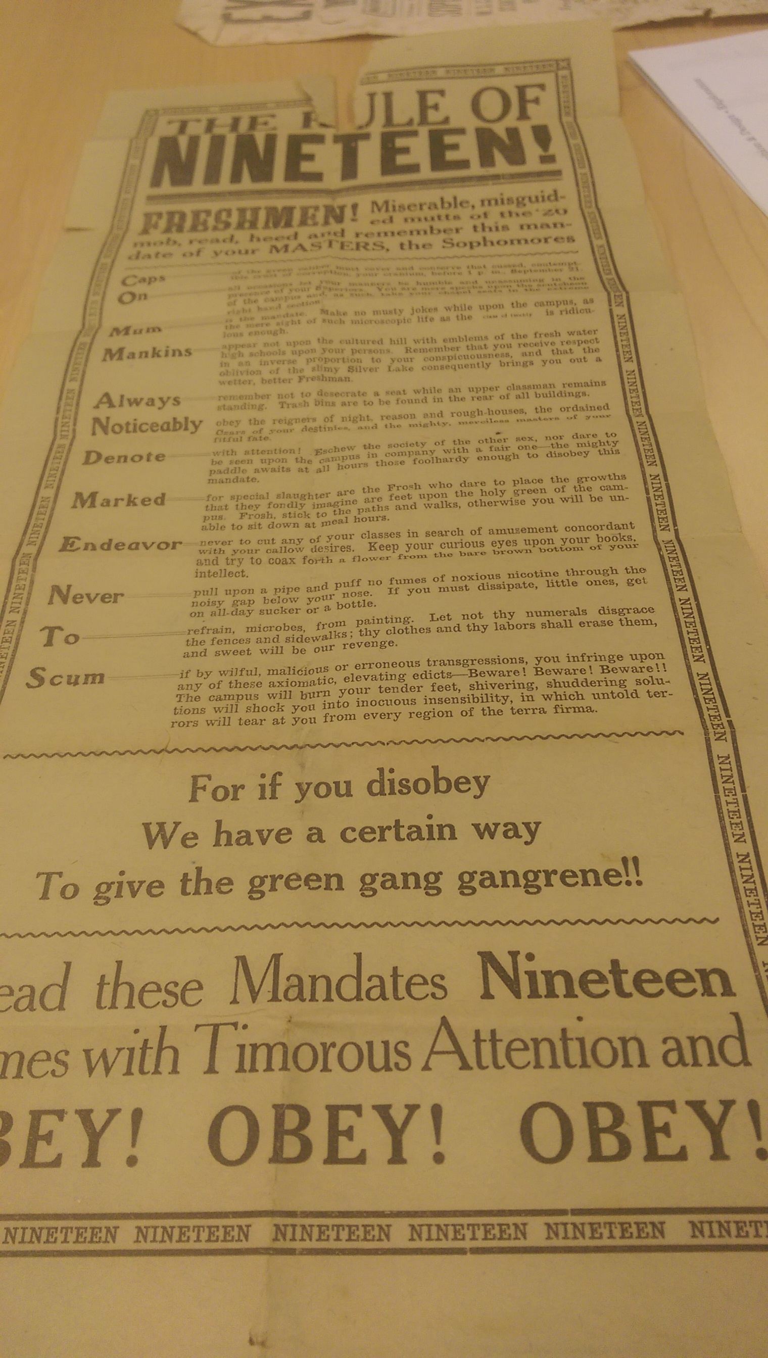
While the “Nineteen!” is certainly the heaviest pieces of text, what caught me first and got my attention was at the bottom, where it says, “OBEY! OBEY! OBEY!” now, perhaps because it was laying down and not posted, that affected what I saw first, but because of it’s size and because the leading in that section was further apart, it really separated itself from the rest of the broadside. As you work your way down the poster, the leading in general seems to get wider, giving it this feeling of thinning. It makes the top seem heavier, but the bottom stuff feels a bit more important because of readability. As though the goal were to make the rules seem overwhelming in order to intimidate the freshmen, but then to make the idea of Obeying seem simpler, to encourage a mind-set that life will be easier if the Freshmen just play along and don’t try to cause trouble.
The one criticism I have really, about how they used the display text was the making the first word of each rule so prominent… There are times to use a strategy like that, i.e. when all the rules start with the same first word, or when the words themselves work as a short hand reminder of what the rules might be. “Caps” Works, because it’s the rule about wearing your cap, but almost none of the rest work because their first word has little importance to the overall meaning. Especially always because the rule is a reminder to always remember to NOT do something.
