
Gary Joseph boxing broadside poster
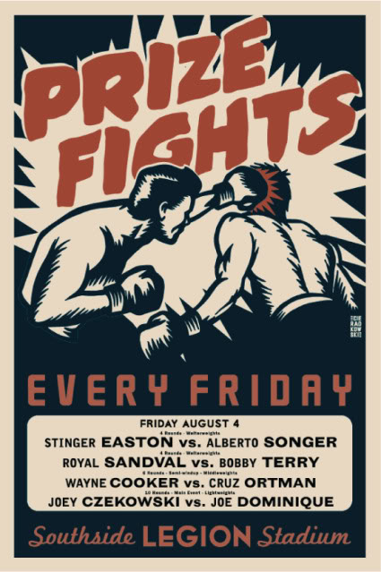
Like the Kyle Schlesinger broadside posters, this Gary Joseph post for boxing would be under the category of “everything but poetry” in the reading. This is a broadside for boxing in the 50’s, 60’s. It has bold and colorful graphics. The bright red type “Prize Fights” draws the reader into the poster because it is on a light background. The broadside uses display type, meaning larger type size for the title, as well as smaller type for the detailed information about the fights, such as the famous fighters. Images are also used on this broadside to help give more detail about these fights. The reader wouldn’t know they were boxing fights if it wasn’t for the image. This broadside could show total immersion in the text because the title “Prize Fights” is supposed to look like a comic book “pow” and demonstrate pop art. All the text at the bottom of the poster makes it bottom heavy and unbalanced because it has a lot of information causing visual weight. this allows the reader to continue to read the whole poster because the eye starts top and goes to the bottom. the type has even letter spacing in the box, but the different red type all have different fonts and letter spacing. “Every Friday” letter spacing is more spread out then the “Southside Legion Stadium.” There is a little overlap of the image on top of the title, but the rest of the broadside does not have any overlap. The text is still legible throughout the whole poster making it easy for the reader to read.
