
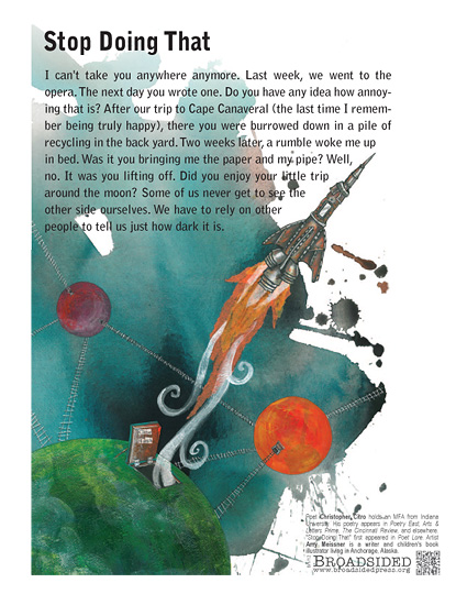
In this broadside, the designer Amy Meissner takes Christopher Citro’s poem “Stop Doing That” and creates a visual piece that complements the author’s words, demonstrating the idea of total immersion. The broadside itself is organized with the poem aligned on the top left with the visual of a rocket ship shooting from the bottom of the broadside to the top right. This organization draws the reader/viewer to read the text as their eyes meet the rocket ship that in a way borders the edge of the paragraphed text. However, the visual is not fully understood by the reader until the poem is finished as the author describes a trip to the moon at the very end. As a re
Written by Christoper Citro
Illustrated by Amy Meissner
sult, the reader/viewer must fully complete the poem before being completely immersed in the broadside.
The text chosen in this broadside is very legible and as a newspaper style typeface with the color of the text being black. While the text itself is legible, the dark painted background depicted behind the left side of the main text does make the text hard to read at times. Because of this, it is necessary for the reader/viewer to read closely so that they are able to read and understand the broadside as a whole. Yet this is not a negative aspect of he broadside, but rather a tactic to fully immerse the reader/viewer in the text and visual together at the same time. In this way, the broadside is successful in the notion of total immersion.
