
Author Kristin Sharp
Designer: Ken Baughman
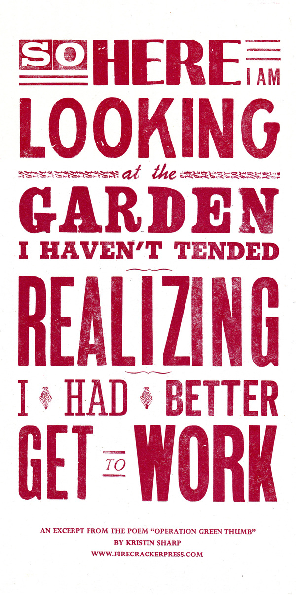
This excerpt reminded me of one of the screen plays I had been writing and how I have not been able to take the time to finish it. I am not sure this is an example of total immersion. There is a strong emphasis on the text and is lacking any visual illustration with the text. The way the text is aligned along with the design choices create one unified image.
The designer chose to use a different type face for each row of the Broadside. There are even multiple typefaces used within these rows. The text is aligned in a way that creates one shape and has no overlapping or overlaying. While there is no illustrations, much focus has been put on the presentation of the words. Letter are chipped, bold, re sized, and faded to give the broadside an older or aged look. This design is a display type.The focus is on the the poetry rather than the author or name of the poem. The large scale of the text is effective emphasizing words like “Here”, “Looking”, “Realizing”, and “Get Work”.
