
Font
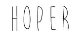
The text I chose greatly influenced the mood I wanted my typeface to omit. I wanted the font to appear somewhat handwritten, while looking simplistic and somewhat irregular and organic. I started out wanting to use a modular method, however after creating a few letters I realized that I wasn’t really following the process or system by which a modular method is made. I didn’t use a grid and because of its irregularity maybe it was a materials-based method. Upon the conclusion I realized I maybe executed this part of Project 3 incorrectly so I will probably end up changing my alphabet. However, I did create a set of rules that I want my ultimate text to have. I think these rules will pair with my text well as it is a children’s story that is still pretty heavy in philosophical discussion about selfishness and selflessness. Since the content is heavy, but the book is a children’s book, I wanted a light, condensed font to mirror the organic, simple nature of the book.
1. X height is same height as capital letter (text will be all caps)
2. Sans serif font
3. Uppercase
4. Minimal contrast, thin weight
5. Upright posture for the most part, some letters will be somewhat askew/angled to portray organic/irregular nature
6. condensed width
7. Font will appear handwritten, somewhat sloppy to imitate content of story
8. Most straight lines will be at least somewhat curved, again to demonstrate irregularity

Lauren: Revise your rules as needed. You may certainly combine some modular rules with a concrete, materials- or environmental-based source. I would recommend finding a specific materials-based visual reference for the irregular and organic qualities you describe. You have a strong description of your text’s mood and meaning. How can this lead to strong visual choices?
LikeLike