
Apple iPhone 5C screenshot (self-taken)
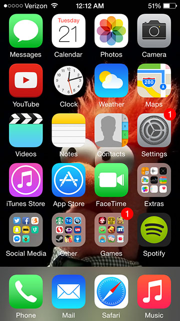
For my use of Helvetica in a design, I chose iOS 8, the operating system run on iPhones and iPads. In using Helvetica, I think the designers at Apple wanted to convey readability and stability. iOS has long been lauded for being a stable operating system, and I think that they chose this typeface to typographically communicate this. The geometric shape of the letters, combined with the balance of the letterforms make the typeface feel like it does not have a lot of motion, and really conveys the stability that comes to mind when customers think of iOS.
The designers of iOS also wanted a typeface that would be highly legible on screens. Sans serif fonts tend to be more legible onscreen than serif typefaces, and the size of the letterforms in iOS 8 enable the text to be read at multiple sizes.
The visual overhaul from iOS 6 to iOS 7 (and 8 by extent) was intended to show that iOS was a modern operating system. Helvetica, especially in its thinner styles is a very modernistic typeface, and the choice to use a thinner form of the font was a very deliberate one.
Helvetica is a transitional sans serif font, which puts it somewhere between a geometric sans serif and a humanist sans serif font. Its letters are very uniform, and it tends to be legible at a smaller size, thanks to the relatively large letterforms.
