
Cards Against Humanity LLC
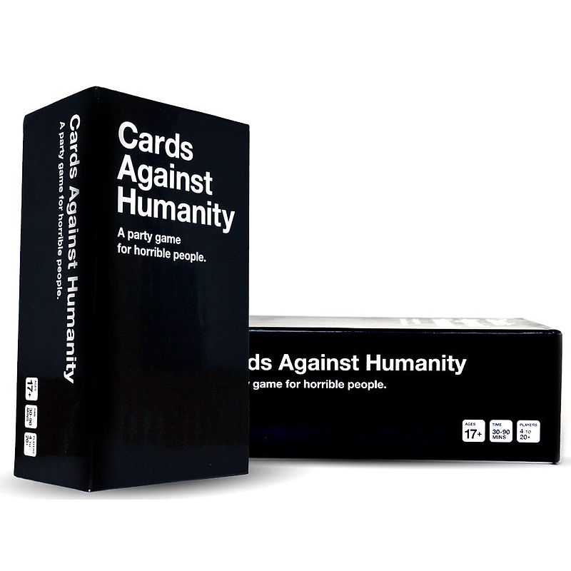
I had not realized that the typeface used for Cards Against Humanity was Helvetica. I think this font is appropriate for hiding the dark comedic nature of the card game. Helvetica is clear and easy to read. This makes delivering the dark humor used in the game simple and effective. They could have picked a more decorative typeface that would convey the card game’s dark humor. But the company may have simply wanted a corporate feel to make the card game appear like an officially licensed product.
The scale of the title remains consistent throughout. This does not include the sub text which is slightly smaller than the title itself. Only the first letter of each word is capitalized in the title. All of the text seem to be aligned to the right side with no indent. The type classification for Helvetica is Transitional Sans Serif. The Type Family used looks to be Bold Helvetica. I do not think they mixed type families in the title as it carries the same weight throughout. The white text on black makes the title of the game immediately recognizable. Also, while there is little punctuation used on the box cover, periods are consistently used on the white cards.
