

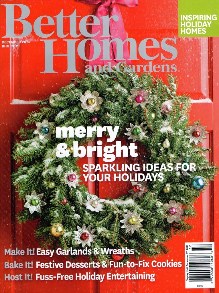
This is a magazine cover for Better Homes and Gardens. I chose a Christmas issue because I love Christmas and am super excited for it although it is a ways away. I thought that the use of type on this cover was very well thought out. There is not too much type distracting from the rest of the cover, but instead, just enough for the viewer to know the magazine title as well as what to expect on the inside. The large, bold, white text catches the viewers eye and instantly draws them in. I chose to look at the subtitle on the magazine because I found its purpose to be more interesting than just the title. We always expect a title, but sometimes it is the other text that we are really looking for and in this example, that text is very clear and visible.

The creators of this cover chose to use a contrasting font for the subtitle. The magazine’s title uses a transitional serif style, while the subtitle uses transitional sans serif. The subtitle is also in all lowercase characters. Both the b and t have overhangs that go just below the baseline. The g’s extends below the baseline with its curvy descender. The ascenders are not very long and compared to other typefaces. The counter of the b is very small. This typeface has a heavy stroke weight which makes it very visible to the viewer. The size is very large compared to other text on the cover which also makes it stand out. This particular use seems to be a bold version of the typeface. If used as more than a subtitle, say for a whole paragraph, the reader would have more trouble reading it, but as just a short title, the viewer can easily key in on it and read it.
As stated before, I think this typeface is appropriate for this content because it contrasts with the title of the magazine as the title uses a typeface with serifs and this one is a san serif. Its boldness also helps it to stand out to the viewer.
