
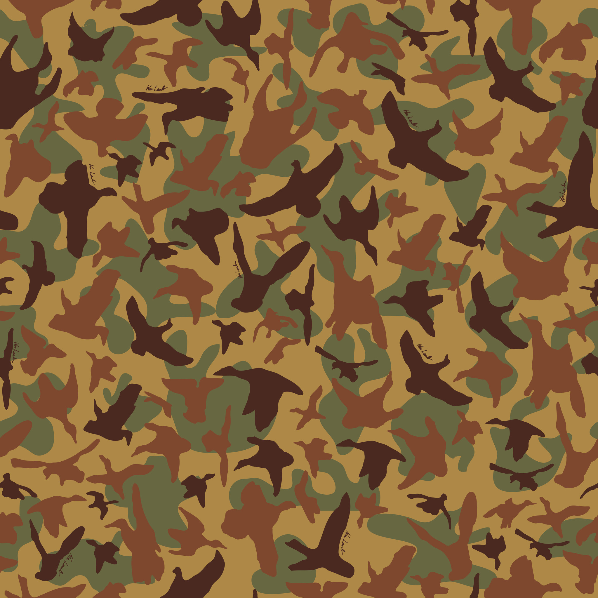
I thought the best idea for an example of an organic pattern would be Camo, there are a lot of different types of Camo, so below is just one example.
from: http://wmlambandson.com/products/fabric-on-the-wing-camo
What drew me to this example was that they used birds to create the image instead of just random blobs, but it keeps the random appearance necessary to make it function properly. It feels very random, but you can tell if you look across the top and bottom that if it were tiled it would tile seamlessly. (from left to right there is a big orange bird, a small orange bird, a big brown bird, a brown bird’s wing tip, and so on) The colors are all fairly low temperature, and low saturation and analogous, they are intended to not draw the attention, even the contrasting values of the colors are used such that they reduce the ability for something to stand out which is usually the opposite purpose of contrast. This pattern does a very good job of hiding any semblance of structure while still having an even feel to it. As Camo, it’s job is to mimic organic surroundings, and as such any sense of rigid structure would work against it’s purpose.
For a more geometric pattern, I found this simple pattern:

from: http://www.vectortiles.com/seamless-geometric-patterns/
Pretty much the opposite of my other example, this pattern has a very rigid structure. The grid is very easy to see since the individual pieces create obvious squares, and the straight lines of the shapes also create really obvious lines. The reason I picked this one was because of the way the color creates almost a 3d effect. By having the darker value colors in the bottom right, that gives us a direction where the light source is coming from (the idea of shadow is what’s giving us depth here) but it isn’t until we consider the different hue of the bottom left half that we see the 4 triangles as 4 distinct sides to a pyramid shaped object. In fact this method works so well that unless you deliberately try to, it’s hard for our eyes to see anything other than repeating squares, despite the fact that a strong recoloring could make the squares hard to see all together.
