
By: Haley Fischer (http://www.haleyfischer.com/blog/2014/1/21/senior-thesis)
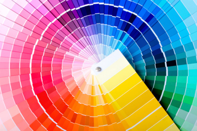
I chose this image to represent interaction of color because of the way the design really blends all the colors into each other. Some design only focus on primary colors (red,yellow,blue) or some with secondary (orange, green, purple). But in this design, it looks as if it is a graduated color wheel made up of small tiles that have a different shade of the color in it’s segment. The choice of order is not random either, the colors adjacent to one another are next to one another on the color wheel so they blend together more effectively. As you move vertically on the design, the color in the segment changes in saturation so it becomes lighter closer to the center and darker/more saturated as you move toward the middle, then lighter toward the edge. This technique playing with value and saturation gives this design a much more unique feel than if it was just simply a color wheel. By having different saturations, the wheel becomes much more detailed and provides countless more color options. There is also texture in the design which gives it an interesting feel. Between each color palette there is a white blank space which gives the feel that each square is on it’s own (almost like a post it note). This gives each square a raised feeling that looks like tiles, so when you look far away each color segment appears to be just a color, but as you get closer, its made up of tiny squares each with a different hue and color. This is a great example of selective emphasis, how the designer uses color to change the way the shapes are perceived.
