

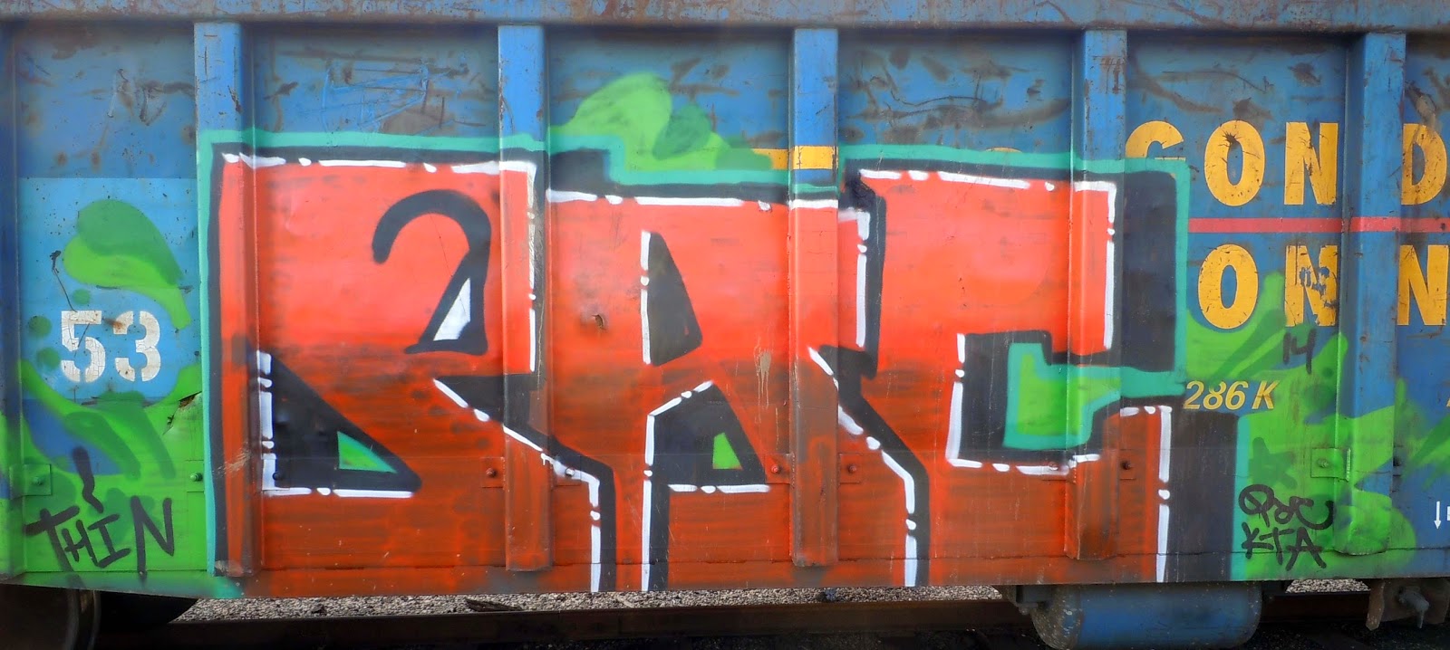
Punching Holes in the Rah Rah by Steve Banks
http://1.bp.blogspot.com/-LgKK0WJmTBc/U7b1WW17PNI/AAAAAAAAHjw/r2Guq7tUCd4/s1600/Train+20.jpg
Punching Holes in the Rah Rah by Steve Banks shows a good combination of complimentary colors. The graffiti is a red hue that stands out against its complementary color blue, which is the background. The color interaction between the two hues makes the red stand out. Having both the blue and the red being primary colors, the artist added secondary colors such as the green and orange giving the image a better contrast between the colors.
Since the red is the dominate color in this photo, the artist uses cool colors in the background to make the red pop. This adds a balance of warm and cool temperature to the photo. The value of the background (green and blue) is darkened to make the red and orange stand out. The red and orange have a strong saturation because they are made bright to stand out against the background. The red has a white outline causing the red value to lighten and have a greater intensity to it. This photo has a good color interaction throughout it.
