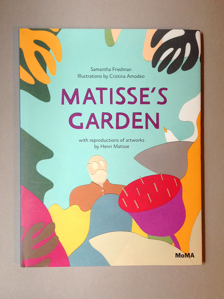
The interaction of color on “Matisse’s Garden” by Samantha Friedman is of interesting nature. Most of the colors in the cover have a higher level of saturation such as the reds, purples, black and orange however some also have a lower level of saturation like the light blue background and some greens. The hue and shades of color gives for a nontraditional feel as it almost projects a pastel feel. The red and purple “flower” or whatever that is definitely pops out due to the high saturation factor. The colors surrounding the “flower” are slightly less saturated but are still more than the blue background which gives the effect of depth. As far the the color congruity goes, there is a wide array of color choices and it is not analogous but more complimentary because of how many colors there are. Primary and secondary colors are used as well as shades like grey. Notice how the designer purposely used colors in a shade and saturation that we’re not typically used to seeing. Doing this along with the odd color choice makes this book cover stand out as different than most. You can obviously tell that the artist of this image was strongly focused on making an impact through the visual spectrum.
y