
The Smashing Book #3 by Multiple Authors.
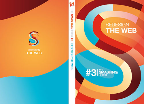
I have chosen “The Smashing Book #3” as an example of the interaction of color. This book cover utilizes many different colors, ranging from dark browns to reds to light blues. These colors interact and contrast with one another to give the book cover feeling and depth. The lighter, cooler colors such as the light blue and white highly contrast the dark browns and strong reds that they lay next to on the cover, which creates the letter “S.”
The colors themselves are highly saturated and therefore very vibrant. This is beneficial to the book, as it is focused on modern design (with the main focus being web design) which commonly uses bright and vibrant colors rather than low-saturated ones.
The colors on this design compliment each other very well. As mentioned before, there is a strong contrast between the warmer and cooler colors. However, the cover is dominated mostly by the darker, warmer colors, which allows for an overall warmer feel when viewing the image. The cooler colors only serve as a bonus, giving a highlight to the dominant warmer colors.
