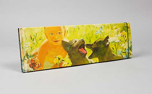
Once in Lifetime
Book tittle: Talking Heads
http://www.sagmeisterwalsh.com/work/project/talking-heads/
The picture to my left titled “Once in a Lifetime” represents a positive combination of colors. To begin, my eye is first drawn to the yellow saturated background that defines the color choice for the
piece. I use the term color choice because, by choosing that soft yellow it set the hues and values for the rest of the piece. My eye then moves toward the golden baby. The golden baby is an analogous color because it is built off the same hue as the background color, which in this case is a golden brown yellow. I believe the author chose to use such an analogous color because it blends in the object but keeps a similar color wheel. Next, my eye is then drawn to the two dogs. I would describe that these dogs have a different intensity color among the spectrum of colors that were chosen. The intensity is described because it goes along with the color wheel but has the darker tones to make it stand out. The intensity is a darker brown but till has the yellow combination to complement the picture as a whole. Once looking at these dogs, the background is the next area that my eye is attracted too. The back ground colors complement the piece because they are colors that exemplify the opposite of what is originated. Some of the colors that are included in the complement spectrum are reds, greens, blues, and orange. These colors are soft in the background and highlight the other characteristics of the painting. These objects are relatively small in scale compared to the large baby and dogs. This is because the main objects represent the strongest use of color while the smaller scale objects trim the overall piece.
