
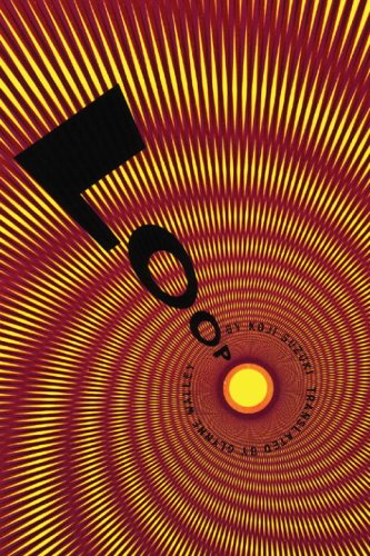
Cover of Loop, by Koji Suzuki, found on the Book Cover Archive. Designed by Chip Kidd.
The book cover I chose only has three colors: yellow, red, and black. The yellow is extremely saturated, while the red is a darker shade. The two colors are both primary colors, so I wouldn’t say that they are complementary, nor would I say that they are tertiary. However, they both are warm colors, and they could be considered analogous.
The cover uses alternating patterns of the yellow and red to create an especially vibrant juxtaposition. Because the difference between the shade of red and the shade of yellow is so great, the point where they meet actually creates a very interesting phenomenon. The red and yellow seem to create an orange hue where they meet, despite there not being any actual orange hues in the cover. This contrast creates a sort of vibration effect, and it makes the piece feel very unstable, as if the cover is shifting, or moving ever so slightly as the viewer looks at it.
Additionally, the point at which the yellow meets the red (the tops and bottoms of the yellow rhombus) creates a juxtaposition between the darker shade of the red and that of the yellow. The color of the tips of the rhombuses seem to have a darker shade, even though the yellow remains constant throughout, similar to the Bezold Effect.
