
License Copyright All rights reserved by Let’s Be Friends Okay
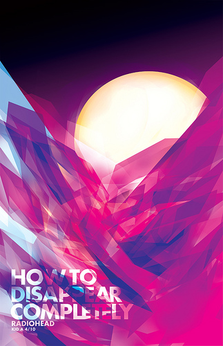
This is a poster designed based upon the song “How to Disappear Completely” by Radiohead. It showcases an interesting interaction between colors and effectively demonstrates the use of color in a design poster.
When we look at the poster, there are three main colors that stick out: blue, red, and purple. On the left side of the poster we see a shade of light blue, yet as we draw our eye over the poster from left to right we see the blue becoming darker. These different hues provide contrast, balance, and a sense of warmth when compared to the fiery red found in the middle and right of the poster. While there seems to be only one shade of red, the interaction of the primary colors blue and red creates the secondary color purple. The purple within the poster is subtle, yet the intensity of the red makes the purple feel warm along with the darker blue and seemingly radiates out into the black sky that fills the upper half of the poster. The yellowish moon or sun behind the color design also creates an interesting contrast to the mix of primary colors below it as it is noticeably lighter than the rest of the colors on the poster (except the light tinted blue). This element actually makes the sun/moon almost more intense than the other colors in the poster and I would argue is the first thing an observer would view.
