
Burj Khalifa by Romain Trystram. This was part of a series called “The Tallest Skyscrapers”, to illustrate skyscrapers all over the world. This is located in Dubai.
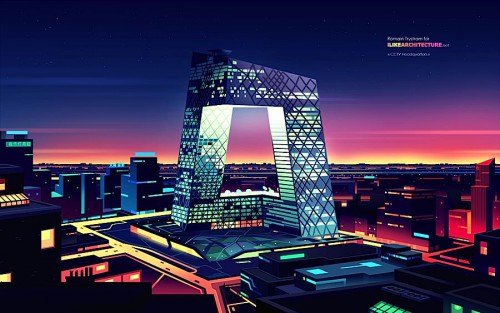
In this color, the illustrater, Romain Trystram, used primary colors and secondary colors. In addition, he used warm and cool colors so the warmer colors (red, orange, yellow) stood out more. It created a vibrant color contrast. All of the colors in this picture are highly saturated and also quite intense because the darker hues and darker colors bring out the brighter ones. This picture is full of both complementary and near complementary colors. The blue and purple complement the orange and yellow and the red and orange are analogous on the color wheel. There is selective emphasis on the building and the roads below, even though the building is a cooler color and the road warmer colors. They both stand out from the top and bottom of the picture. The horizon also stands out to emphasis that it is dusk. The darker colors are definitely muted in this picture since the brighter colors stand out a lot more.
However, on the lower part of the illustration, the other buildings seem to fade to a darker color as the hue darkens. It shades into the darkness to further emphasis where the eyes should be drawn to on the picture. However, the tint is apparent towards the middle of the main, looped building as your eyes approach the middle of it. The tint in the middle of the illustration makes the dusk look a lot brighter, compared to the dusk at the edges of the picture, which are slightly more shaded and darker.
