
Nathan Zehr. Poster for Colorado education. Graphis.com
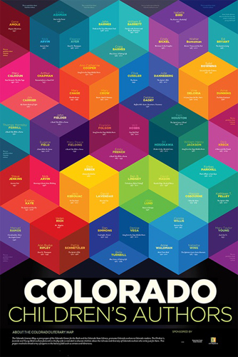
The poster design is a good use of various colors to portray the blocks on the page. Each color either helps intensify or dim the colors around it, depending on which color it borders. For example, the blues that are side by side tend to diminish and blend together as one; it’s harder to differentiate each one. However, when the blues are next to a complementary color such as an orange, they stand out a lot more. Same with the purple and yellow blocks; being complements, they help the other pop and in this design, those blocks are the most attention grabbing because of it. This design also uses a variation of complementary and analogous colors, as some of the blocks have minimal differences between them all. There are red blocks connected to purple blocks, and green blocks connected to blue blocks. So while there are a couple instances of complementary colors (purple and yellow together, blue and orange together), it’s mostly an analogous composition.
There is a good contrast of hues, intensity, value, and saturation in this design as well. Each block has a different hue, one being darkest and one being lightest, which gives the perception of depth to each square. The variation in hues also shows difference in value of each of the colors. The darker colors have a lower value (and in this instance also a darker intensity) and the lighter colors have a higher value. The intensity of certain colors stand out among the rest; the yellow, orange, and pinks in particular. The top yellow square has a bright intensity to it, and the left pink square on the second row does as well. Lastly, the saturation of some of the squares is much lower; the colors look almost muddier because of the purity of the saturation. It’s especially apparent in the blues; the blue square on the second row, and the middle blue square on the bottom.
